Bilim adamları hakkında sahip olduğunuzu iddia ediyor
Sitenizin başlık alanındaki metin çok önemli bir bilgi kaynağıdır. Ne diyosun elbette önemlidir, ancak dikkate alınması da önemlidir Nasıl sen söyle.
Tipografi web sitenizin sesidir. Doğru tipografiyi seçmek yalnızca mesajınızı aktarmanıza yardımcı olmakla kalmaz, aynı zamanda tonu etkileme ve hatta markanızı daha tanınabilir hale getirme gücüne de sahiptir. Bu nedenle dünyada klasikten çılgına kadar seçebileceğiniz 300,000'den fazla yazı tipi bulunmaktadır.

Kanadalı sanatçı Jenny Shipper'ın yazı tipi Federico Fellini'nin filmlerine bir övgü niteliğinde
Bu kadar çok seçenek varken, özellikle de yazı tiplerinin birlikte nasıl çalıştığını bilmiyorsanız, kendi doğru stilinizi bulmak zor olabilir. Bu yazıda, dönüştüren bir başlık mesajı tasarlamanıza yardımcı olmak için favori yazı tipi eşleştirmelerimizden bazılarını gözden geçireceğiz.
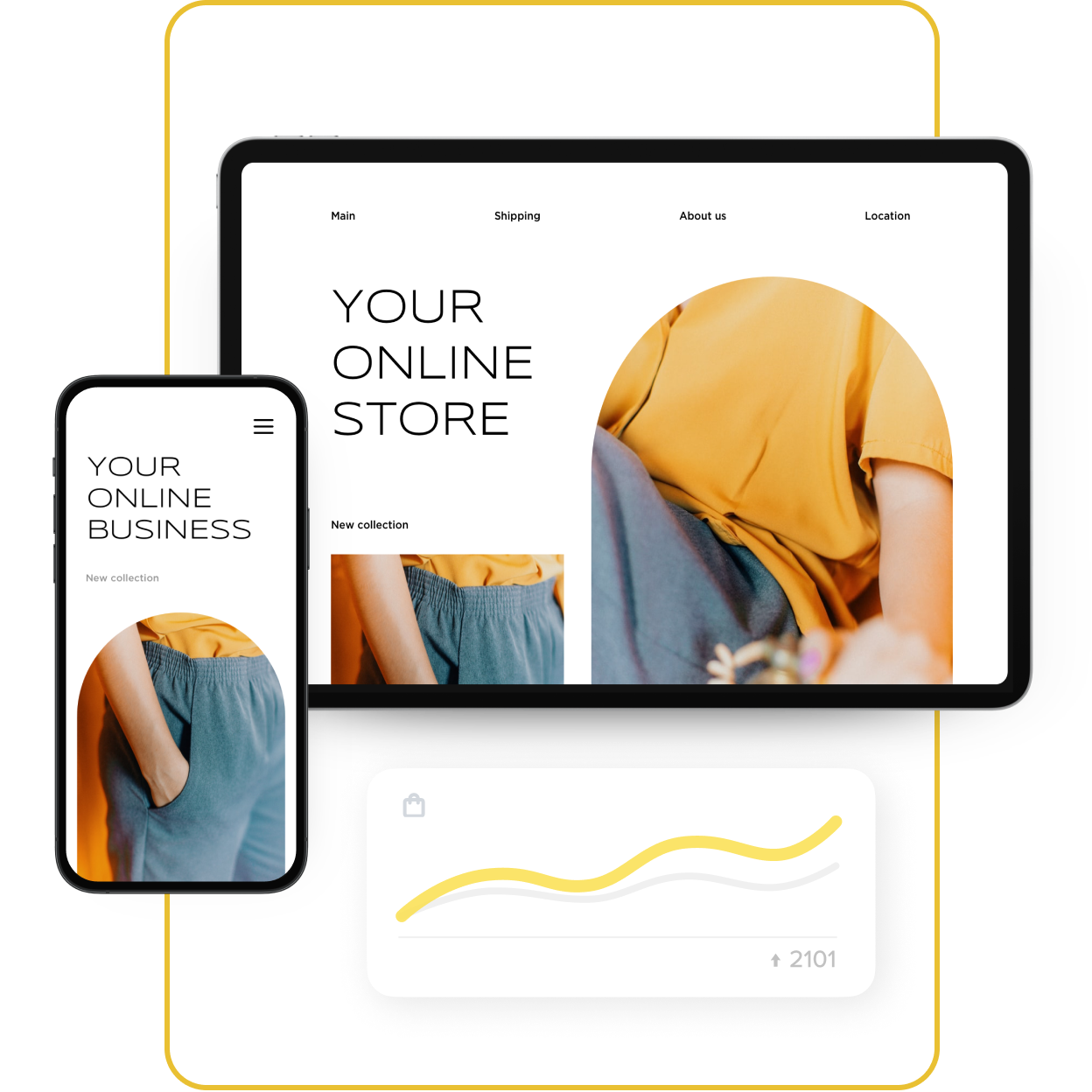
Aşağıdaki tüm örnekler, mağazanızı hızla kurup satışa sunmanızı sağlayacak etkili bir e-ticaret sitesi oluşturucusu olan Ecwid Instant Site'da bulunan tasarım araçlarıyla oluşturulmuştur. Hızlı Site'nin tasarım seçenekleri hakkında daha fazla bilgi edininya da kaydolmak onu çalışırken görmek için.
Ecwid Instant Site düzenleyicisinde yazı tipleri nasıl değiştirilir:
- Şuraya git: Web Sitesi Ecwid kontrol panelinizdeki sekmeyi açın ve “Düzenle”yi tıklayın;
- “Başlık ve Kapak”ı seçin;
- Mağazanızın başlığını ve açıklamasını yazın. Kapak düzeninizi seçin ve gerekirse konumunu ve hizalamasını değiştirin. İsterseniz buradan arka planınızı ve harekete geçirici mesaj düğmesini de değiştirebilirsiniz;
- Aşağı kaydırın ve “Tipografi”yi seçin;
- Başlığınız ve açıklamanız için yazı tipi ailelerini, renklerini ve boyutlarını seçin;
- İşiniz bittiğinde “Kaydet” butonuna basmayı unutmayın.
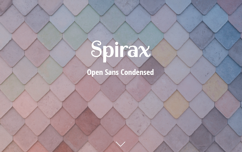
Spirax + Açık Sans Yoğunlaştırılmış
Spirax'in orijinal kıvrımları manşetlere zarif ama ilginç bir görünüm kazandırır.
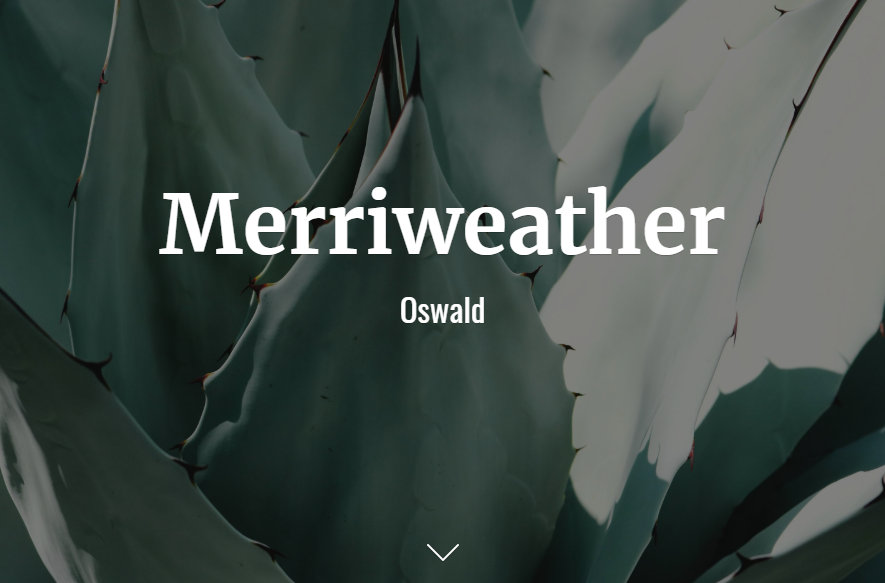
Merriweather + Oswald
Merriweather, hafif yoğunlaştırılmış harf formları, sağlam serifleri ve açık formlarıyla ekranlarda okumak keyifli. 19. yüzyılın sonları ve 20. yüzyılın başlarındaki klasik gotik ve grotesk tarzlardan ilham alan bir yazı tipi olan Oswald ile mükemmel bir uyum içindedir. Bu eşleştirme, satış yapan bir mağazaya uygun olabilir.
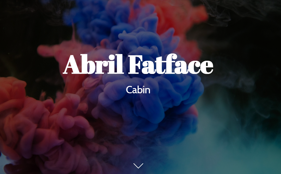
Abril Fatface + Kabin
İnce serifler ve
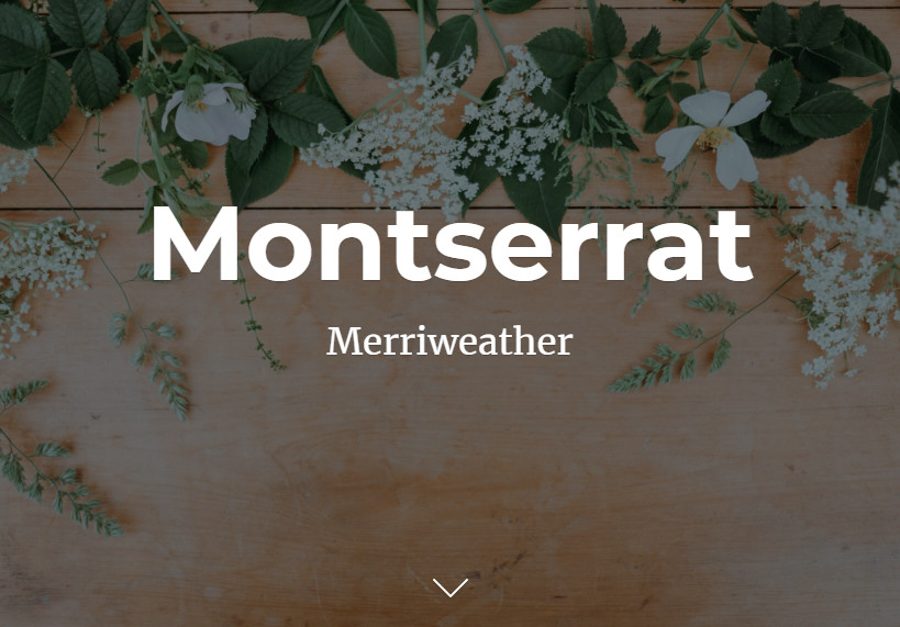
Montserrat + Merriweather
Montserrat, Merriweather'ın hafifçe kısaltılmış harf biçimleriyle tamamlanan, 20. yüzyılın ilk yarısından kalma kentsel tipografiye dayanıyor. Bu eşleştirme bir çanta veya spor ayakkabı mağazasında iyi bir şekilde sunulabilir.
Overlok + Nunito
Overlok'un yuvarlatılmış glif şekilleri harika başlıklar ve kısa metinler oluşturur

Playfair Ekran + Kaynak Sans Pro
Playfair Display'in klasik stili, kullanıcı arayüzlerinde iyi çalışacak şekilde oluşturulan Source Sans Pro ile eşleştirildiğinde daha da ön plana çıkıyor. Bu zamansız kombinasyon, kadın güzellik ürünleri veya giyim mağazalarında uzmanlaşmış mağazalarla iyi uyum sağlayacaktır.

Alegreya + Lato
Alegreya'nın dinamik ve çeşitli ritmi sayfaya tazelik katarak Lato'nun

Rokkitt + Lato
Rokkitt, başlıklarda ve başlıklarda görüntü yazı tipi olarak kullanılmak üzere tasarlandı. Bununla birleştirin

Bataklık Kumu + Proxima Nova
Geometrik şekiller Quicksand'in temel temelini oluşturur, bu nedenle tasarımınıza temiz ve taze bir dokunuş kazandırmak için onu Proxima Nova'nın modern duyarlılığıyla eşleştirin. Oyuncak veya bebek arabası satıyorsanız bu yazı tipleri işinize yarayabilir.

Oksijen + Maven Pro
Oxygen, özellikle Maven Pro'nun kolay okunabilirliğiyle birlikte tüm grafik kullanıcı arayüzlerinde, masaüstü bilgisayarlarda ve cihazlarda iyi çalışır. Web siteniz gözlük veya fitness aksesuarları satıyorsa bu eşleştirmeye göz atın.

Dans Senaryosu + Lato
Canlı ve rahat Dans Senaryosu, Lato'nun klasik oranlarını ve şık san serif estetiğini vurgulayarak sayfanıza samimi ve resmi olmayan bir dokunuş katar. Hediyelik eşya ve kartpostal mağazaları bu setten yararlanabilir.

Signika + Doz
Signika'nın nazik karakteri manşetler için harika çalışıyor, Dosis ise ek metinlerin okunmasını oldukça kolaylaştırıyor. Bu eşleştirme, elektronikten çiçeğe kadar geniş bir mağaza yelpazesi için işe yarar.

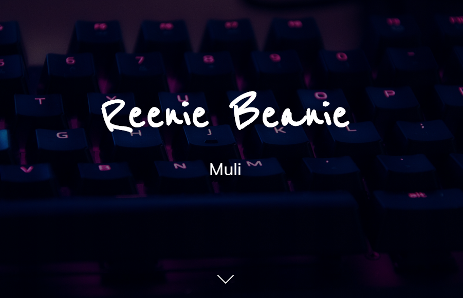
Reenie Beanie + Muli
Reenie Beanie temele dayalıdır
Görev + Çoklu
San serif Muli mükemmel bir gövde metni yazı tipi oluşturur ve abartısız estetiği, çok çeşitli başlık yazı tipleriyle iyi bir şekilde eşleştiği anlamına gelir: modern stili ve tasarımıyla Questrial gibi.

Berkshire Swash + Proxima Nova
Berkshire Swash, canlı bir başlık oluşturan ve Proxima Nova'nın basit, modern oranları ve geometrik görünümüyle inanılmaz bir denge sağlayan cesur ama nazik bir yeteneğe sahiptir. El yapımı kozmetikler veya tatlılar bu karışımdan faydalanacaktır.

Yazı Tipi Eşleştirmelerinin Temelleri
Listemizde aradığınızı bulamadınız mı? Kendinizi yaratıcı hissediyorsanız yazı tipleriyle oynamayı deneyin Anlık Site düzenleyicisinde ve kendi güzel yazı tipi kombinasyonunuzu bulun.
İzlenecek bazı temel yönergeler şunlardır:
- Yazı tipleriniz arasında bir kontrast oluşturun (kalın ve el yazısı, UZUN ve kısa)
- Serif'i birleştir ve
düz harfler yazı tipleri (Libre Baskerville + Signika gibi). - Hem başlığınız hem de gövde metniniz için iki benzer yazı tipi (örneğin, iki el yazısı) kullanmayın. Çeşitlilik yaratmak dikkat çekecek ve müşterinizin her bölümle ayrı ayrı ilgilenmesine yardımcı olacaktır.
- Yazı tipinin markanıza uygun olmasını sağlayın. Eğlenceli el yazısı mektuplar muhtemelen birinci sınıf bir mücevher markası için en uygun seçenek değildir.
- Kendinizi sınırlayın
2-3 İçeriğinizin darmadağın görünmesini önlemek için yazı tipleri.
Ayrıca okuyun: Ecwid ile Oluşturulan 50 Örnek Çevrimiçi Mağaza
- Mağazanızın Gezinmesini Nasıl Düzeltebilirsiniz?
- Ürün Satışı Hakkında Bilmeniz Gereken Her Şey
- Çevrimiçi Mağazacılık: Çevrimiçi Mağazada Ürünlerin Yerleşimi Nasıl Yapılır?
- Moda Mağazacılığı Nedir ve Neden Bu Kadar Önemli?
- Online Mağazaların 10 Tasarım Hatası
- E-Ticaret Web Siteniz için 15 Mükemmel Yazı Tipi Eşleştirmesi
- Renk Teorisi: Renk Temaları Hakkında Bilmeniz Gereken Her Şey
- E-ticaret Ürün Sayfanız için 7 Yaratıcı Fikir
- Web Tasarımında Kahraman İmajının Gücü
Olması Gereken Çevrimiçi Mağazada İzlenecek Kullanıcı Deneyimi İlkeleri- Web Sitesi Tasarım Denetimi
- E-ticaret için UX Tasarımının Gücünün Kilidini Açmak
- E-ticarette UI ve UX Arasındaki Fark Nedir?