

Ste se kdaj vprašali, zakaj trgovine z živili postavljajo mleko na zadnji del trgovine in čokolade blizu blagajne?
Enostavno: namestitev osnovnih stvari na zadnji del trgovine spodbudi kupce, da se sprehodijo in brskajo po drugih izdelkih. Postavljanje majhnih predmetov (kot so čokolade) blizu blagajne spodbuja impulzivne nakupe.
Vse to je del znanosti o oblikovanju trgovin. The pravilna postavitev trgovine lahko poveča prodajo, izboljša zvestobo in strankam pomaga hitreje najti, kar želijo.
Vaša spletna trgovina ni nič drugačna. Organizacija in postavitev vaših izdelkov močno vplivata na to, kaj (in kako) kupci kupujejo pri vas.
V tem članku vam bomo pokazali, kako razporediti svoje izdelke, da povečate prodajo in konverzije.
3 stvari, ki jih je treba upoštevati pri izbiri postavitve izdelka
Postavitev izdelka se lahko sliši kot preprosta težava, ko se je prvič lotite. Vendar, kot večina stvari v
1. Izbira
Izbira je a

Učinkovita postavitev izdelka je v bistvu proces uravnoteženja te dvojnosti. To je: ustvarjanje vtisa obilice izbire, hkrati pa je spletno mesto preprosto za uporabo in krmarjenje.
Znanost pravi da je odločanje duševno obremenjujoče. Ko kupce soočite s preveč izbirami, se lahko zgodi, da se sploh ne bodo odločili.
Kako torej premagati to težavo pri postavitvi vaše trgovine?
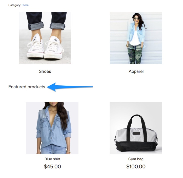
Ena rešitev je uporaba predstavljenih slik, ki vodijo do dodatnih izdelkov. Na primer, opazite, kako Made.com uporablja ločene slike za celotne kategorije izdelkov (kot je »vrtno pohištvo«):

Zamislite si to kot zbadljivko za privabljanje kupcev.
V idealnem primeru bi želeli obdržati svojega
Zato preden začnete s postopkom postavitve, navedite naslednje:
- Vaša celotna ponudba izdelkov in pripadajoče kategorije in podkategorije
- Funkcionalne kategorije, kot so »najbolje prodajani izdelki«, »predstavljeni izdelki« itd., in izdelki v njih.
Naslednji korak je uporaba teh informacij za izdelavo a

Na ta način bodo kupci lažje našli, kar želijo, ne da bi jih preobremenili s preveliko izbiro.
Če je vaša trgovina Ecwid dodana spletnemu mestu, lahko dodate navigacijski meni tako, da dodate del kode:
- za horizontalno postavitev
- za navpično postavitev.


Tukaj so dodana navodila za trgovine Ecwid WordPress in Wix tudi spletne strani. Na spletnem mestu Ecwid Instant je na voljo samo vodoravni meni.
2. Informacije o izdelku
Tukaj je še eno ravnotežje, ki ga morate izvesti pri izbiri postavitve trgovine: prikaz informacij o izdelku.
Strankam želite dati informacije, ki jih potrebujejo, da kliknejo in opravijo nakup. Hkrati pa jih ne želite zasuti s preveč podrobnostmi – vsaj ne preden so na dejanski strani izdelka.
Vaš mentalni model v tej situaciji bi moral biti olajšanje sprejemanja odločitev in vzbuditi zanimanje strank. Vprašajte se: kaj minimalne informacije ali morajo moje stranke klikniti na izdelek?
Ugotovili boste, da se ta odgovor razlikuje od trgovine do trgovine in izdelka do izdelka.
Opazite na primer, kako vam Amazon na strani s kategorijami ponuja samo štiri informacijske točke: ime izdelka, ceno (vključno s popustom), oceno in prvo razpoložljivost:

V Ecwidu lahko dodate podobne ocene in ocene s pomočjo aplikacije Stampled.io.
Čeprav so te informacije potrebne za velikega trgovca na drobno, kot je Amazon, za manjša podjetja, kot je npr Nakit iz peska in kamna, ocene niso tako pomembne. Zato strani s kategorijami prikazujejo samo ime izdelka in ceno.

Zlahka se ujameš v past, da na straneh s kategorijami podaš premalo informacij. Najboljši način, da se temu izognete, je, da intervjuvate svoje stranke in jih vprašate, katere informacije uporabljajo pri odločanju o nakupu.
3. Oblikovanje trgovine
Kako ste zasnovali svojo trgovino, bo močno vplivalo na postavitev vašega izdelka.
An
- Domača stran
- Strani s kategorijami in iskanjem
- Strani s posameznimi izdelki
Katere izdelke izberete za predstavitev na vsakem
Upoštevajte na primer, kako Amazon oglašuje svoje izdelke na domači strani, če niste prijavljeni:

Običajno je, da trgovine na domači strani promovirajo najnovejše ponudbe. Poskrbite, da boste te ponudbe uskladili s svojo ciljno publiko. BestMadeCo, na primer, vodi promocijo za očetovski dan, pri čemer upošteva večinoma moške stranke.

Osredotočiti se na:
- Ugotavljanje izdelkov, za katere želite, da kupci kupijo (v idealnem primeru vaše najbolje prodajane izdelke in/ali izdelke z najvišjo maržo)
- Ohranjanje enotnosti oblikovanja v različnih
vrste strani.
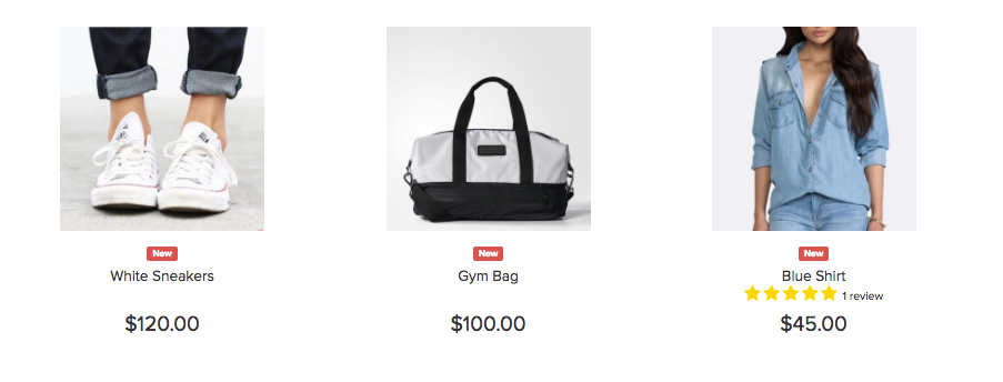
Ne glede na to, ali se odločite izpostaviti svoje prodajne uspešnice ali nove izdelke, vam Ecwid omogoča ustvarjanje kategorije za predstavljeni izdelki na domači strani in ga poimenujte glede na svoje potrebe.
6 najboljših praks za E-trgovina Postavitev izdelka
Čeprav lahko zagotovo ustvarite edinstveno shemo postavitve za vašo
1. Potisnite vrhunske izdelke in ponudbe na vrhu strani
Območje »nad pregibom« je del zaslona, ki je viden, ko stranke prvič pridejo na vaše spletno mesto. Pravzaprav to področje predstavlja 80 % vse pozornosti gledalcev na večini spletnih mest.
Glede na to, kakšno pozornost je deležen ta prostor, je dobro, da vrhunske izdelke postavite na pregib. To lahko vključuje:
- Najnovejše ponudbe, razprodaje in popusti
- Najbolje prodajan izdelek ali kategorije izdelkov
- Nedavno predstavljeni izdelki (najbolje deluje na začetku nakupovalne sezone)
On Target.com, boste na primer videli najnovejše ponudbe na vrhu strani:

Če imate veliko ponudb, razmislite o dodajanju drsnika, kot je ta primer iz Walmarta. Upoštevajte tudi promocije, ki potekajo pod navigacijskim menijem:

Nekateri trgovci z modnimi izdelki se izogibajo običajnim postavitvam v korist promoviranja podobe blagovne znamke. Vklopljeno ASOS, na primer, dobite podobo blagovne znamke z možnostjo »Nakupujte moške« ali »Nakupujte ženske«.

Ta taktika deluje, ko poskušate z lookbookom promovirati vizijo blagovne znamke. Večina trgovcev na drobno pa se bo bolje odrezala s konvencionalnim
Sledite isti zamisli na straneh s kategorijami: potisnite svoje

2. Mešajte vodoravne in navpične postavitve
V bistvu obstajata dva načina, kako lahko svoje izdelke postavite na katero koli stran: vodoravno ali navpično.
Vodoravna postavitev ostane statična. Na robu strani je gumb za nadaljnje pomikanje po seznamih.
Ta primer iz Amazona stvari bolje ponazarja:

V Ecwidu, nedavno ogledanih izdelkov so prikazane tudi vodoravno. Izberete lahko število elementov, ki jih želite prikazati na vrhu ali na dnu vaše izložbe.

Podobni izdelki je drugo

Nasprotno pa navpična postavitev nima teh drsnih gumbov. Namesto tega vidite vedno več izdelkov v a

V idealnem primeru bi morali uporabiti mešanico obeh postavitev:
- Vodoravna postavitev, ko želite prikazati nekaj izdelkov iz številnih kategorij, na primer v nedavno ogledanih izdelkih
- Navpična postavitev, ko želite prikazati veliko izdelkov iz iste kategorije, na primer eno iskanje in strani s kategorijami
3. Sledite konvenciji in pričakovanjem uporabnikov
Obstajajo situacije, ko boste želeli biti nekonvencionalni s svojim dizajnom. Postavitev izdelka ni ena izmed njih.
Postavitev vašega izdelka je namenjena usmerjanju uporabnikov, ko pridejo na vaše spletno mesto. Konvencionalna postavitev zagotavlja, da najdejo, kar hočejo, in se ne zmedejo.
Konvencije se seveda razlikujejo od sektorja do sektorja. Vendar morate upoštevati nekaj stvari:
Uporabite mrežno postavitev
V mrežni postavitvi so izdelki razporejeni v

Ta postavitev je že dolgo običajna
Ko uporabljate to postavitev, poskrbite, da bodo škatle enake velikosti. Kot kaže ta študija primera, lahko uporaba enako velikih polj poveča prihodek na obiskovalca za kar 17 %.

Če prodajate z Ecwidom, to za vas ni problem — Ecwid ima enako veliko mrežo, ki se samodejno prilagaja različnim zaslonom.
Pokaži navigacijo na vrhu seznamov izdelkov
Drug dogovor, ki ga morate upoštevati, je, da svoje možnosti razvrščanja postavite na vrh strani.

Stranke so to umestitev pričakovale in bodo seveda pogledale sem, ko bodo pristale na strani s kategorijami.
Stranke usmerite z drobtinicami
Drobtine so navigacijski elementi, ki uporabnikom prikazujejo njihovo pot z domače strani, kot je ta:
Če jih dodate na vrh strani, se obiskovalci lažje orientirajo. Pove jim, v kateri strani ali kategoriji so in kako se lahko vrnejo na domačo stran.
4. Osredotočite se na vizualne elemente, vendar ne pozabite na besedilo na straneh izdelkov
Na spletu je edini način, da svoje izdelke prikažete z vizualnimi elementi. Zato je znano, da velike slike izdelkov spodbujajo
Čeprav so vizualni elementi pomembni, mora imeti vaša postavitev tudi prostor za opisno besedilo. Dobra kopija ne le opisuje izdelek, ampak tudi pomaga pri prodaji izdelka in vaše blagovne znamke.
Na primer, razmislite o tem, kako BestMadeCo uporablja močno besedilo na svoji domači strani za prodajo nedavno predstavljenega izdelka. Postavitev pomaga, da se besedilo odlično ujame s sliko.

Kopija izdelka je še posebej pomembno na straneh izdelkov. Vaša postavitev mora strankam dati vse ključne informacije, ki jih potrebujejo za odločitev tik nad mejo. To bi moralo vključevati:
- Cena (vključno s popustom, prikazano vizualno)
- Ocena izdelka in število ocen
- Imena izdelkov in blagovnih znamk
- Ali je izdelek na zalogi (in ali je zaloga primanjkovala)
- Podrobnosti o dostavi
2-3 ključne podrobnosti o izdelku
To je primer, kako ne postavljati izdelkov. Stran izdelka sploh nima kopije — težko se je odločiti.

Kot pri večini stvari je tudi tukaj Amazonova postavitev popolna, saj strankam nudi vse, kar potrebujejo za odločitev.

5. Dodajte priporočila za izdelke in sorodne izdelke
Na straneh izdelkov imate dva cilja:
- Spravite kupca na stran za odjavo, oz
- Privabite stranko, da si ogleda drug izdelek
Za slednje bi morali imeti razdelek priporočenih ali povezanih izdelkov. To lahko postavite za informacije o izdelku ali pred njimi.
Amazon to počne še posebej dobro. Opazite sorodne izdelke in sezname »tudi ogledanih« pod pregibom:

Če imate več izdelkov v isti zbirki, poskrbite, da jih tudi prikažete. Tu je dober primer s spletnega mesta WorldMarket:

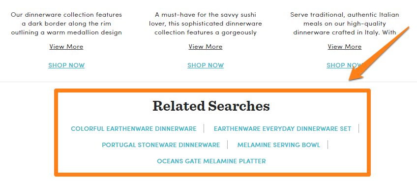
Ni nujno, da so povezani seznami izdelkov vizualni. Prav tako lahko prikažete sorodna iskanja, da stranke usmerite k predmetom, ki bi jih morda zanimali.
Eksperimentirajte z različnimi postavitvami za sorodne/priporočene izdelke. Poskusite jih postaviti nad nogo, pod opis izdelka itd.
6. Eksperimentirajte s podrobnostmi miške na straneh s kategorijami
Eden od načinov za izboljšanje
Na primer, po tej strani prikaže podrobnosti o izdelku in gumb za dodajanje v košarico ob miškinem kazalcu:
Namen te taktike je uporabnikom dati ključne informacije na prvi pogled. Najbolje deluje, ko pričakujete, da bodo uporabniki hitro brskali po velikem številu izdelkov, na primer v trgovinah z oblačili. Za druge kategorije morda ne bo delovalo, vendar lahko še vedno izvedete nekaj delnih testov in si ogledate rezultate.
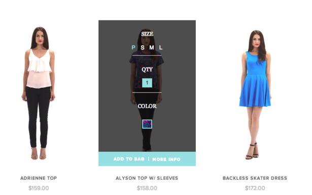
V Ecwidu lahko omogočite gumbe »Kupi zdaj« na seznamih izdelkov, da svojim strankam pomagate hitro brskati (in kupiti) vaše izdelke.

Ko stranka klikne tak gumb, vaša trgovina ne odpre celotne strani izdelka. Namesto tega bo vaša stranka videla pojavno okno z možnostmi izdelka:

Če vaš izdelek nima možnosti, bo šel naravnost v košarico.
zaključek
Ko gre za postavitev izdelkov, je najbolje, da se držite konvencije in sledite temu, kar že počnejo vodilni na trgu. Podrobno katalogizirajte svoje izdelke, jih temeljito kategorizirajte in jih nato organizirajte v standardni mrežni postavitvi.
Najboljše prakse, navedene zgoraj, bodo delovale za večino trgovin v različnih sektorjih. Preizkusite jih v svoji trgovini!
- Kako popraviti navigacijo vaše trgovine
- Vse, kar morate vedeti o trženju izdelkov
- Spletno trgovanje: Kako razporediti izdelke v spletni trgovini
- Kaj je modno trženje in zakaj je tako pomembno?
- 10 oblikovalskih napak spletnih trgovin
- 15 popolnih parov pisav za vaše spletno mesto e-trgovine
- Teorija barv: Vse, kar morate vedeti o barvnih temah
- 7 kreativnih idej za vašo stran izdelka e-trgovine
- Moč glavne slike v spletnem oblikovanju
Must-have Načela UX, ki jih morate upoštevati v spletni trgovini- Revizija oblikovanja spletne strani
- Odklepanje moči oblikovanja UX za e-trgovino
- Kakšna je razlika med UI in UX v e-trgovini?


