

Te-ai întrebat vreodată de ce magazinele pun lapte în spatele magazinului și ciocolată lângă casă?
Simplu: plasarea lucrurilor esențiale în spatele magazinului îi încurajează pe cumpărători să se plimbe și să răsfoiască alte produse. Plasarea obiectelor mici (cum ar fi ciocolata) lângă casă încurajează achizițiile impulsive.
Toate acestea fac parte din știința designului magazinului. The aspectul corect al magazinului poate crește vânzările, poate îmbunătăți loialitatea și poate ajuta clienții să găsească mai repede ceea ce își doresc.
Magazinul dvs. online nu este diferit. Organizarea și aspectul produselor dvs. au un impact mare asupra a ceea ce (și cum) cumpără clienții de la dvs.
În acest articol, vă vom arăta cum să vă configurați produsele pentru a maximiza vânzările și conversiile.
3 lucruri de luat în considerare atunci când alegeți un aspect al produsului
Dispunerea produsului poate suna ca o problemă simplă atunci când o abordați pentru prima dată. Cu toate acestea, ca majoritatea lucrurilor din
1. Alegere
Alegerea este a

Aspectul eficient al produsului este în esență un proces de echilibrare a acestei dualități. Adică: oferind impresia de alegere abundentă, păstrând în același timp site-ul ușor de utilizat și de navigat.
Știința spune acea luare a deciziilor este o problemă mentală. Când vă confruntați cu cumpărătorii cu prea multe alegeri, aceștia sunt susceptibili să nu facă deloc o alegere.
Deci, cum depășiți această problemă în aspectul magazinului dvs.?
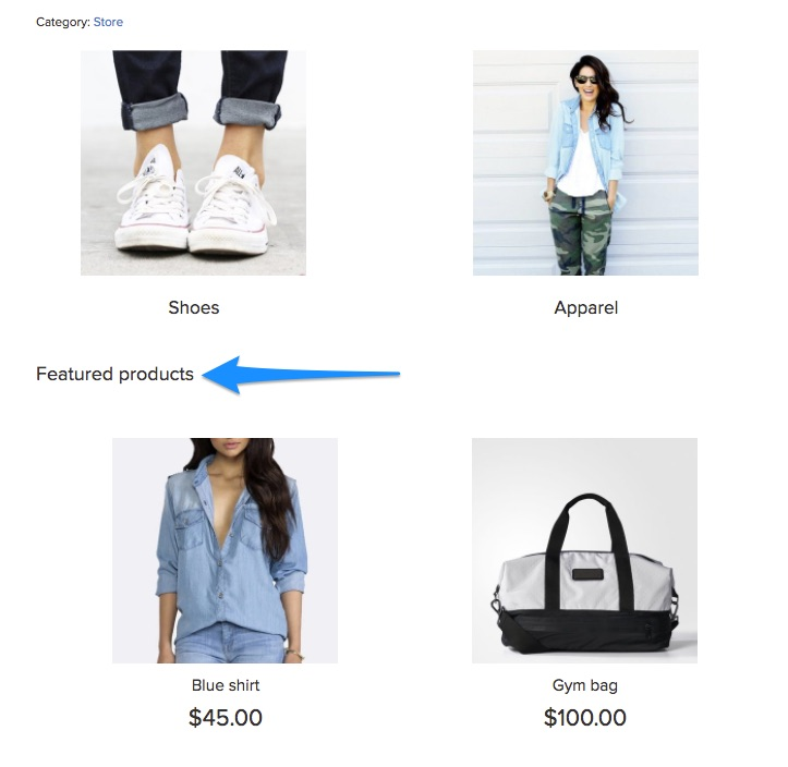
O soluție este utilizarea imaginilor prezentate care duc la produse suplimentare. De exemplu, observați cum Made.com folosește imagini separate pentru întregi categorii de produse (cum ar fi „mobilier de grădină”):

Gândiți-vă la asta ca la un teaser pentru a atrage cumpărătorii.
În mod ideal, veți dori să vă păstrați
Prin urmare, înainte de a începe procesul de layout, enumerați următoarele:
- Întreaga dvs. gamă de produse și categoriile și subcategoriile respective
- Categoriile funcționale precum „produse cele mai vândute”, „produse recomandate” etc. și produsele din acestea.
Următorul pas este să folosiți aceste informații pentru a construi a

Acest lucru îi va ajuta pe cumpărători să găsească ceea ce își doresc fără a-i copleși cu prea multe opțiuni.
Dacă magazinul dvs. Ecwid este adăugat la un site web, puteți adăuga un meniu de navigare adăugând o bucată de cod:
- pentru un aspect orizontal
- pentru un aspect vertical.


Iată instrucțiunile pentru magazinele Ecwid adăugate WordPress și Wix site-uri web, de asemenea. Pe site-ul Ecwid Instant, meniul orizontal este disponibil numai.
2. Informații despre produs
Iată un alt act de echilibru pe care ar trebui să îl efectuați atunci când selectați un aspect al magazinului: afișarea informațiilor despre produs.
Doriți să oferiți clienților informațiile de care au nevoie pentru a face clic și a face o achiziție. În același timp, nu doriți să-i copleșiți cu prea multe detalii - cel puțin nu înainte de a fi pe pagina reală a produsului.
Modelul tău mental în această situație ar trebui să fie acela de a ușura luarea deciziilor și de a stârni interesul clienților. Întrebați-vă: ce informatii minime clienții mei trebuie să facă clic pe un produs?
Veți descoperi că acest răspuns variază de la magazin la magazin și de la produs la produs.
De exemplu, observați cum Amazon vă oferă doar patru puncte de informații pe pagina categoriei: numele produsului, prețul (inclusiv reducerea), evaluarea și disponibilitatea Prime:

În Ecwid, puteți adăuga evaluări și recenzii similare cu ajutorul aplicației Stampled.io.
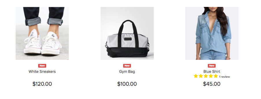
Deși aceste informații sunt necesare pentru un mare retailer precum Amazon, pentru companiile mai mici precum Bijuterii de nisip și piatră, evaluările nu sunt la fel de importante. Prin urmare, paginile categoriei arată doar numele și prețul produsului.

Este ușor să cazi în capcana de a oferi prea puține informații în paginile categoriei. Cel mai bun mod de a evita acest lucru este să intervievezi clienții și să-i întrebați ce informații folosesc pentru a lua decizii de cumpărare.
3. Design magazin
Modul în care v-ați proiectat magazinul va avea un impact mare asupra aspectului produsului.
An
- Pagina principală
- Pagini de categorii și de căutare
- Pagini de produse individuale
Ce produse alegeți să prezentați pe fiecare
De exemplu, rețineți cum Amazon își promovează propriile produse pe pagina sa de pornire dacă nu v-ați conectat:

Este obișnuit ca magazinele să promoveze cele mai recente oferte pe pagina de pornire. Asigurați-vă că aliniați aceste oferte cu publicul țintă. BestMadeCo, de exemplu, organizează o promoție de Ziua Tatălui, ținând cont de clientela sa majoritară masculină.

Concentrează-te pe:
- Aflați ce produse doriți să cumpere clienții (în mod ideal cele mai vândute și/sau cele mai mari produse cu marjă)
- Menținerea uniformității designului în diferite
tipuri de pagini.
Indiferent dacă decideți să vă evidențiați cele mai bune vânzări sau noile sosiri, Ecwid vă permite să creați o categorie pentru produse prezentate pe pagina principală și denumește-l în funcție de nevoile tale.
6 Cele mai bune practici pentru E-commerce Aspect produs
În timp ce puteți crea cu siguranță o schemă unică de aspect pentru dvs
1. Împingeți produsele și ofertele de top deasupra pliului
Zona „de deasupra pliului” este imobilul ecranului vizibil atunci când clienții aterizează pentru prima dată pe site-ul dvs. De fapt, această zonă reprezintă 80% din toată atenția spectatorilor pe majoritatea site-urilor.
Având în vedere atenția pe care o primește acest spațiu, este o idee bună să plasați produsele de top deasupra pliului. Aceasta poate include:
- Ultimele oferte, reduceri și reduceri
- Cele mai vândute produse sau categorii de produse
- Produse lansate recent (funcționează cel mai bine la începutul sezonului de cumpărături)
On Target.com, de exemplu, veți vedea cele mai recente oferte în partea de sus a paginii:

Dacă aveți o mulțime de oferte, luați în considerare adăugarea unui glisor, cum ar fi acest exemplu de la Walmart. De asemenea, rețineți promoțiile care rulează sub meniul de navigare:

Unii comercianți de modă evită machetele convenționale în favoarea promovării unei imagini de marcă. Pe ASOS, de exemplu, obțineți o imagine de marcă cu opțiunea „Shop Men” sau „Shop Women”.

Această tactică funcționează atunci când încercați să promovați o viziune de brand cu un lookbook. Majoritatea comercianților cu amănuntul, totuși, se vor descurca mai bine cu un convențional
Urmați aceeași idee pe paginile categoriei: push your

2. Amestecați planuri orizontale și verticale
Există, în esență, două moduri prin care vă puteți dispune produsele pe orice pagină: orizontal sau vertical.
Un aspect orizontal rămâne static. Există un buton la marginea paginii pentru a derula în continuare listele.
Acest exemplu de la Amazon ilustrează lucrurile mai bine:

În Ecwid, produse vizionate recent sunt prezentate și pe orizontală. Puteți alege numărul de articole pentru a le afișa deasupra sau în partea de jos a vitrinei dvs.

Produse asemănătoare este alta

În schimb, un aspect vertical nu are aceste butoane de defilare. În schimb, vezi tot mai multe produse într-un

În mod ideal, ar trebui să utilizați o combinație a acestor două aspecte:
- Aspect orizontal atunci când doriți să afișați câteva produse din mai multe categorii, cum ar fi în Produse vizualizate recent
- Aspect vertical atunci când doriți să afișați o mulțime de produse din aceeași categorie, cum ar fi o singură căutare și pagini de categorie
3. Urmați convențiile și așteptările utilizatorilor
Există situații în care veți dori să fiți neconvențional cu designul dvs. Aspectul produsului nu este unul dintre ele.
Aspectul produsului dvs. este menit să orienteze utilizatorii atunci când ajung pe site-ul dvs. Un aspect convențional îi asigură că găsesc ceea ce își doresc și nu se dezorienta.
Convențiile, desigur, variază de la sector la sector. Cu toate acestea, există câteva lucruri pe care trebuie să le luați în considerare:
Utilizați un aspect al grilei
Într-un aspect de grilă, produsele sunt aranjate în

Acest aspect a fost mult timp convenția pentru
Când utilizați acest aspect, asigurați-vă că păstrați cutiile de dimensiuni egale. După cum arată acest studiu de caz, utilizarea casetelor de dimensiuni egale poate crește venitul per vizitator cu până la 17%.

Dacă vindeți cu Ecwid, aceasta nu este o problemă pentru dvs. - Ecwid are o grilă de dimensiuni egale care se adaptează automat la diferite ecrane.
Afișați navigarea în partea de sus a listelor de produse
O altă convenție pe care ar trebui să o urmați este să plasați opțiunile de sortare în partea de sus a paginii.

Clienții au ajuns să se aștepte la această plasare și vor căuta în mod natural aici atunci când ajung pe o pagină de categorie.
Orientați clienții cu pesmet
Breadcrumb-urile sunt elemente de navigare care arată utilizatorilor calea lor de pe pagina de pornire, astfel:
Adăugarea acestora în partea de sus a paginii ajută la orientarea vizitatorilor. Le spune în ce pagină sau categorie se află și cum pot reveni la pagina de pornire.
4. Concentrați-vă pe imagini, dar nu uitați de textul de pe paginile produselor
Online, singura modalitate de a vă prezenta produsele este prin imagini. Acesta este motivul pentru care se știe că imaginile mari ale produselor cresc
Cu toate acestea, deși imaginile sunt importante, aspectul dvs. ar trebui să aibă loc și pentru text descriptiv. O copie bună nu numai că descrie produsul, dar ajută și la vânzarea acestuia și a mărcii dvs.
De exemplu, luați în considerare modul în care BestMadeCo folosește o copie puternică pe pagina sa de pornire pentru a vinde un produs lansat recent. Aspectul ajută textul să se joace perfect cu imaginea.

Copie produs este deosebit de important pe paginile produselor. Aspectul dvs. ar trebui să ofere clienților toate informațiile cheie de care au nevoie pentru a lua o decizie chiar deasupra pliului. Aceasta ar trebui să includă:
- Preț (inclusiv reducere, reprezentat vizual)
- Evaluarea produsului și numărul de recenzii
- Nume de produse și mărci
- Dacă produsul este în stoc (și dacă stocul se epuizează)
- detalii de expediere
2-3 detalii cheie ale produsului
Acesta este un exemplu despre cum să nu dispuneți produsele. Pagina produsului nu are deloc copie - este dificil să luați o decizie.

La fel ca în majoritatea lucrurilor, aspectul Amazon este perfect aici, oferind clienților tot ce au nevoie pentru a lua o decizie.

5. Adăugați recomandări de produse și produse conexe
Pe paginile de produse, aveți două obiective:
- Aduceți clientul la pagina de plată sau
- Aduceți clientul să vadă un alt produs
Pentru acesta din urmă, ar trebui să ai o secțiune de produse recomandate sau conexe. Puteți plasa acest lucru fie după informațiile despre produs, fie înaintea acestuia.
Amazon face acest lucru deosebit de bine. Observați produsele aferente și listele „vizuite și” de mai jos:

Dacă aveți mai multe produse în aceeași colecție, asigurați-vă că le afișați și pe acestea. Iată un exemplu bun de la WorldMarket:

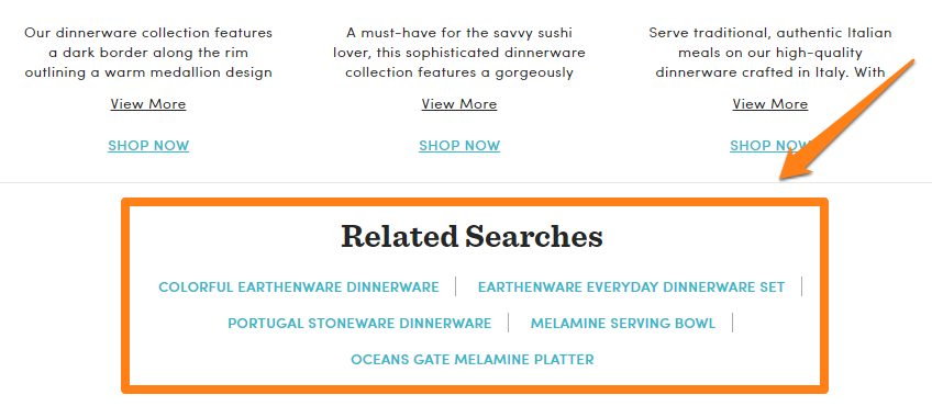
Listările de produse înrudite nu trebuie să fie întotdeauna vizuale. De asemenea, puteți afișa căutări similare pentru a direcționa clienții către articole de care ar putea fi interesați.
Experimentați cu diferite machete pentru produse înrudite/recomandate. Încercați să le plasați deasupra subsolului, sub descrierea produsului etc.
6. Experimentați cu detaliile mouseover pe paginile categoriei
O modalitate de a îmbunătăți
De exemplu, acest site afișează detaliile produsului și un buton de adăugare în coș la trecerea mouse-ului:
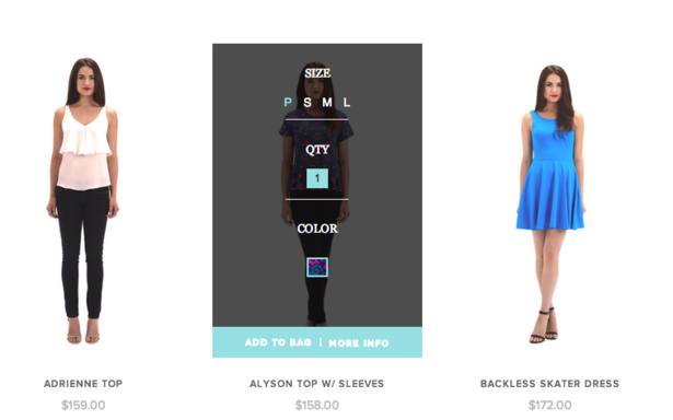
Scopul acestei tactici este de a oferi utilizatorilor informații cheie dintr-o privire. Funcționează cel mai bine atunci când vă așteptați ca utilizatorii să răsfoiască rapid un număr mare de produse, cum ar fi în magazinele de îmbrăcăminte. S-ar putea să nu funcționeze pentru alte categorii, dar puteți rula în continuare câteva teste împărțite și puteți vedea rezultatele.
În Ecwid, puteți activa butoanele „Cumpărați acum” pe listele de produse pentru a vă ajuta clienții să răsfoiască rapid (și să cumpere) produsele dumneavoastră.

Când un client face clic pe un astfel de buton, magazinul dvs. nu va deschide întreaga pagină a produsului. În schimb, clientul dvs. va vedea o fereastră pop-up cu opțiuni de produs:

Dacă produsul dvs. nu are opțiuni, va merge direct în coș.
Concluzie
Când vine vorba de aspectul produsului, cel mai bine este să respectați convențiile și să urmăriți ceea ce fac deja liderii de piață. Catalogați-vă produsele în detaliu, clasificați-le în detaliu, apoi organizați-le într-un aspect standard al grilei.
Cele mai bune practici împărtășite mai sus vor funcționa pentru majoritatea magazinelor din diferite sectoare. Încercați-le în propriul magazin!
- Cum să remediați navigarea magazinului dvs
- Tot ce trebuie să știți despre comercializarea produselor
- Merchandising online: Cum să așezați produsele în magazinul online
- Ce este Fashion Merchandising și de ce este atât de important?
- 10 greșeli de design ale magazinelor online
- 15 perechi perfecte de fonturi pentru site-ul dvs. de comerț electronic
- Teoria culorilor: tot ce trebuie să știți despre temele de culoare
- 7 idei creative pentru pagina dvs. de produse de comerț electronic
- Puterea unei imagini erou în design web
Trebuie avut Principii UX de urmat într-un magazin online- Audit design site
- Deblocarea puterii designului UX pentru comerțul electronic
- Care este diferența dintre UI și UX în comerțul electronic?


