

Oletko koskaan miettinyt, miksi ruokakaupat laittavat maitoa kaupan takaosaan ja suklaata kassan lähelle?
Yksinkertaista: välttämättömien tavaroiden sijoittaminen myymälän takaosaan kannustaa ostajia kävelemään ja selaamaan muita tuotteita. Pienten tavaroiden (kuten suklaan) sijoittaminen kassan lähelle rohkaisee impulssiostoksiin.
Tämä kaikki on osa myymäläsuunnittelun tiedettä. The oikea myymäläasetelma voi lisätä myyntiä, parantaa uskollisuutta ja auttaa asiakkaita löytämään haluamansa nopeammin.
Verkkokauppasi ei ole mitenkään erilainen. Tuotteidesi organisaatiolla ja ulkoasulla on suuri vaikutus siihen, mitä (ja miten) asiakkaat ostavat sinulta.
Tässä artikkelissa näytämme sinulle, kuinka voit asetella tuotteesi myynnin ja konversioiden maksimoimiseksi.
3 asiaa, jotka on otettava huomioon valittaessa tuotteen ulkoasua
Tuotteen asettelu saattaa kuulostaa suoraviivaiselta ongelmalta, kun lähestyt sitä ensimmäistä kertaa. Kuitenkin, kuten useimmat asiat
1. Valinta
Valinta on a

Tehokas tuoteasettelu on pohjimmiltaan prosessi tämän kaksinaisuuden tasapainottamiseksi. Eli: antaa vaikutelman runsaasta valinnanvarasta, mutta silti sivuston käyttö ja navigointi on helppoa.
Tiede sanoo että päätöksenteko on henkisesti rasittavaa. Kun kohtaat ostajat liian monien valintojen kanssa, he eivät todennäköisesti tee valintaa ollenkaan.
Joten miten voit voittaa tämän ongelman myymäläsi ulkoasussa?
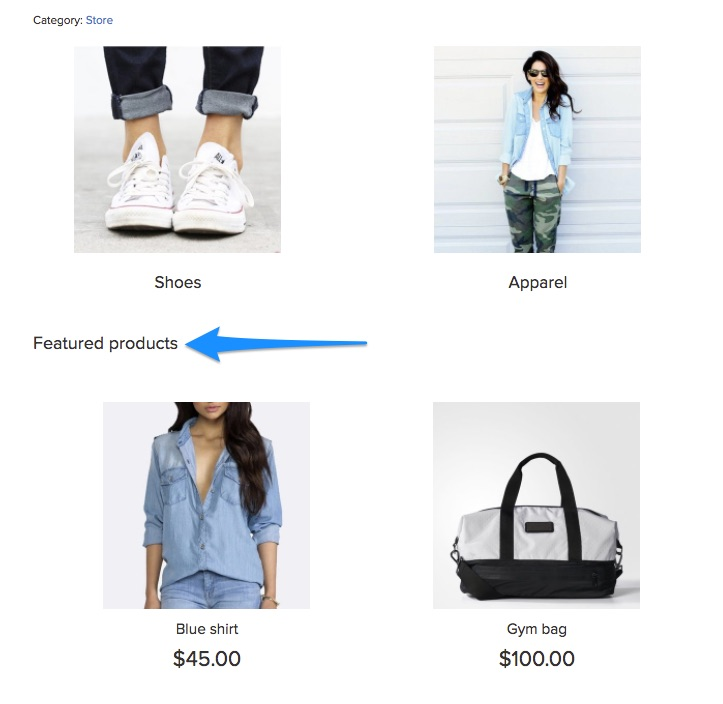
Yksi ratkaisu on käyttää esiteltyjä kuvia, jotka johtavat lisätuotteisiin. Huomaa esimerkiksi kuinka Made.com käyttää erillisiä kuvia kokonaisille tuoteluokille (kuten "puutarhakalusteet"):

Ajattele tätä teaserina houkutellaksesi ostajia.
Ihannetapauksessa haluat pitää omasi
Näin ollen, ennen kuin aloitat asetteluprosessin, luettele seuraavat:
- Koko tuotevalikoimasi ja niitä vastaavat luokat ja alakategoriat
- Toiminnalliset luokat, kuten "myydyimmät tuotteet", "suositellut tuotteet" jne. ja niissä olevat tuotteet.
Seuraava vaihe on käyttää näitä tietoja a

Tämä auttaa ostajia löytämään haluamansa ilman, että heille jää liian monia valintoja.
Jos Ecwid-myymäläsi on lisätty verkkosivustolle, voit lisätä navigointivalikon lisäämällä koodinpätkän:
- vaakasuuntaista asettelua varten
- pystysuoraa asettelua varten.


Tässä on lisätty Ecwid-myymälöiden ohjeet WordPress ja Wix myös nettisivut. Ecwid Instant Site -sivustolla vain vaakasuuntainen valikko on käytettävissä.
2. Tuotetiedot
Tässä on toinen tasapainotustoimi, joka sinun tulee tehdä valitessasi myymälän asettelua: tuotetietojen näyttäminen.
Haluat antaa asiakkaille tietoja, joita he tarvitsevat napsauttaakseen ja tehdäkseen ostoksen. Samaan aikaan et halua hukuttaa niitä liian monilla yksityiskohdilla – ainakaan ennen kuin ne ovat varsinaisella tuotesivulla.
Mielen mallisi tässä tilanteessa pitäisi olla päätöksenteon helpottaminen ja asiakkaiden kiinnostuksen herättäminen. Kysy itseltäsi: mitä vähimmäistiedot täytyykö asiakkaideni napsauttaa tuotetta?
Huomaat, että tämä vastaus vaihtelee kaupasta toiseen ja tuotteista toiseen.
Huomaa esimerkiksi, kuinka Amazon antaa sinulle vain neljä tietopistettä luokkasivulla: tuotteen nimi, hinta (mukaan lukien alennus), arvosana ja Prime-saatavuus:

Ecwidissä voit lisätä samanlaisia arvioita ja arvosteluja Stampled.io-sovelluksen avulla.
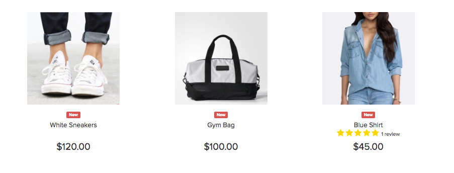
Vaikka nämä tiedot ovat välttämättömiä suurelle jälleenmyyjälle, kuten Amazon, pienemmille yrityksille, kuten Hiekka- ja kivikorut, arvosanat eivät ole yhtä tärkeitä. Tästä syystä luokkasivuilla näkyy vain tuotteen nimi ja hinta.

On helppo pudota ansaan, kun luokkasivuilla annetaan liian vähän tietoa. Paras tapa välttää tämä on haastatella asiakkaitasi ja kysyä heiltä, mitä tietoja he käyttävät ostopäätösten tekoon.
3. Liikkeen suunnittelu
Tavalla, jolla olet suunnitellut myymäläsi, on suuri vaikutus tuotteen ulkoasuun.
An
- Kotisivu
- Luokka- ja hakusivut
- Yksittäiset tuotesivut
Mitä tuotteita haluat esitellä kussakin
Huomaa esimerkiksi, kuinka Amazon mainostaa omia tuotteitaan etusivullaan, jos et ole kirjautunut sisään:

On tavallista, että kaupat mainostavat uusimpia tarjouksia etusivullaan. Varmista, että sovitat nämä tarjoukset kohdeyleisösi kanssa. Esimerkiksi BestMadeCo järjestää isänpäiväpromoa pitäen mielessään pääosin miesasiakkaansa.

Keskittyä:
- Selvitä, mitä tuotteita haluat asiakkaiden ostavan (ihannetapauksessa myydyimmät ja/tai korkeimman marginaalin tuotteet)
- Suunnittelun yhtenäisyyden säilyttäminen eri puolilla
sivutyypit.
Päätät sitten korostaa myydyimpiä tai uusia tulokkaita, Ecwid antaa sinun luoda kategorian esitellyt tuotteet etusivulla ja nimeä se tarpeidesi mukaan.
6 parasta käytäntöä Verkkokaupan Tuotteen asettelu
Vaikka voit varmasti luoda ainutlaatuisen asettelumallin
1. Työnnä huipputuotteet ja tarjoukset sivun yläpuolelle
Sivun yläosassa oleva alue on näytön kiinteistö, joka näkyy, kun asiakkaat saapuvat ensimmäisen kerran sivustollesi. Itse asiassa tämä alue vastaa 80 % katsojien huomiosta useimmilla sivustoilla.
Koska tämä tila saa huomion, on hyvä idea sijoittaa huipputuotteesi taitoksen yläpuolelle. Tämä voi sisältää:
- Uusimmat tarjoukset, alennukset ja alennukset
- Myydyin tuote tai tuoteryhmät
- Äskettäin lanseeratut tuotteet (toimii parhaiten ostoskauden alussa)
On Target.com, näet esimerkiksi uusimmat tarjoukset sivun yläosassa:

Jos sinulla on paljon tarjouksia, harkitse liukusäätimen lisäämistä, kuten tämä Walmartin esimerkki. Huomaa myös navigointivalikon alla käynnissä olevat tarjoukset:

Jotkut muotikauppiaat välttävät tavanomaisia ulkoasuja tuotekuvan edistämiseksi. Päällä ASOS, saat esimerkiksi tuotekuvan, jossa on vaihtoehto "Osta miehiä" tai "Osta naisia".

Tämä taktiikka toimii, kun yrität edistää brändivisiota lookbookilla. Useimmat jälleenmyyjät pärjäävät kuitenkin paremmin perinteisellä
Noudata samaa ideaa luokkasivuilla: työnnä omasi

2. Sekoita vaaka- ja pystyasetelmia
Tuotteet voidaan sijoittaa mille tahansa sivulle periaatteessa kahdella tavalla: vaaka- tai pystysuoraan.
Vaakasuuntainen asettelu pysyy staattisena. Sivun reunassa on painike, jolla voit vierittää tietoja eteenpäin.
Tämä Amazonin esimerkki kuvaa asioita paremmin:

Ecwidissä äskettäin katsotut tuotteet näytetään myös vaakasuorassa. Voit valita tuotteiden määrän näytettäväksi myymäläsi ylä- tai alaosassa.

Aiheeseen liittyvät tuotteet on toinen

Sitä vastoin pystyasettelussa ei ole näitä vierityspainikkeita. Sen sijaan näet yhä enemmän tuotteita a

Ihannetapauksessa sinun tulisi käyttää näiden kahden asettelun yhdistelmää:
- Vaakasuora asettelu, kun haluat näyttää muutamia tuotteita useista luokista, kuten Äskettäin katsotut tuotteet -kohdassa
- Pystyasettelu, kun haluat näyttää useita saman kategorian tuotteita, kuten yhden haku- ja luokkasivun
3. Noudata käytäntöjä ja käyttäjien odotuksia
On tilanteita, joissa haluat olla epätavallinen suunnittelussasi. Tuotteen ulkoasu ei ole yksi niistä.
Tuoteasettelusi on tarkoitettu ohjaamaan käyttäjiä heidän saapuessaan sivustollesi. Perinteinen asettelu varmistaa, että he löytävät haluamansa eivätkä joudu sekaan.
Sopimukset tietysti vaihtelevat sektoreittain. On kuitenkin muutamia asioita, jotka sinun on otettava huomioon:
Käytä ruudukkoasettelua
Ruudukkoasettelussa tuotteet on järjestetty

Tämä asettelu on ollut yleissopimus pitkään
Kun käytät tätä asettelua, varmista, että laatikot ovat samankokoisia. Kuten tämä tapaustutkimus osoittaa, samankokoisten laatikoiden käyttö voi kasvattaa tuloja vierailijaa kohden jopa 17 %.

Jos myyt Ecwidin kanssa, se ei ole sinulle ongelma – Ecwidillä on samankokoinen ruudukko, joka mukautuu automaattisesti eri näyttöihin.
Näytä navigointi tuotetietojen yläosassa
Toinen käytäntö, jota sinun tulee noudattaa, on sijoittaa lajitteluvaihtoehdot sivun yläosaan.

Asiakkaat ovat tottuneet odottamaan tätä sijoittelua ja katsovat luonnollisesti tänne, kun he päätyvät luokkasivulle.
Suuntaa asiakkaat korppujauhoilla
Tarrapolut ovat navigointielementtejä, jotka näyttävät käyttäjille heidän polkunsa etusivulta seuraavasti:
Niiden lisääminen sivun alkuun auttaa vierailijoita orientoitumaan. Se kertoo heille, mihin sivuun tai kategoriaan he kuuluvat ja kuinka he voivat palata etusivulle.
4. Keskity visuaalisuuteen, mutta älä unohda tekstiä tuotesivuilla
Verkossa ainoa tapa esitellä tuotteitasi on visuaalien avulla. Tästä syystä suurten tuotekuvien tiedetään tehostavan
Vaikka visuaalit ovat tärkeitä, ulkoasussasi tulisi kuitenkin olla tilaa kuvaavalle tekstille. Hyvä kopio ei vain kuvaa tuotetta, vaan myös auttaa myymään sitä ja brändiäsi.
Mieti esimerkiksi, kuinka BestMadeCo käyttää vahvaa kopiota kotisivullaan myydäkseen äskettäin lanseeratun tuotteen. Asettelu auttaa tekstiä toistamaan täydellisesti kuvaa vasten.

Tuotteen kopio on erityisen tärkeä tuotesivuilla. Asettelusi pitäisi antaa asiakkaille kaikki keskeiset tiedot, joita he tarvitsevat päätöksentekoon suoraan sivun yläosassa. Tämän pitäisi sisältää:
- Hinta (sis. alennuksen, visuaalisesti esitetty)
- Tuotearvio ja arvostelujen määrä
- Tuote- ja tuotenimet
- Onko tuotetta varastossa (ja onko varasto vähissä)
- Toimitustiedot
2-3 tärkeimmät tuotetiedot
Tämä on esimerkki siitä, kuinka tuotteita ei voi taitella. Tuotesivulla ei ole kopiota ollenkaan – päätöstä on vaikea tehdä.

Kuten useimpien asioiden kohdalla, Amazonin ulkoasu on täydellinen tässä ja tarjoaa asiakkaille kaiken, mitä he tarvitsevat päätöksentekoon.

5. Lisää tuotesuosituksia ja niihin liittyviä tuotteita
Tuotesivuilla sinulla on kaksi tavoitetta:
- Vie asiakas kassasivulle tai
- Pyydä asiakas katsomaan toista tuotetta
Jälkimmäisen kohdalla sinun olisi pitänyt suositeltujen tai vastaavien tuotteiden osio. Voit sijoittaa tämän joko tuotetietojen jälkeen tai ennen sitä.
Amazon tekee tämän erityisen hyvin. Huomioi aiheeseen liittyvät tuotteet ja "myös katsotut" listaukset sivun alaosasta:

Jos sinulla on useita tuotteita samassa mallistossa, muista näyttää myös ne. Tässä hyvä esimerkki WorldMarketista:

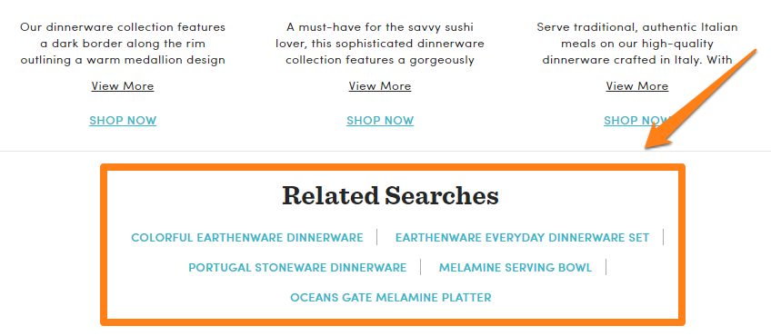
Aiheeseen liittyvien tuoteluetteloiden ei aina tarvitse olla visuaalisia. Voit myös näyttää aiheeseen liittyviä hakuja ohjataksesi asiakkaat kohteille, joista he saattavat olla kiinnostuneita.
Kokeile vastaavien/suositeltujen tuotteiden erilaisia asetteluja. Yritä sijoittaa ne alatunnisteen yläpuolelle, tuotekuvauksen alle jne.
6. Kokeile hiiren osoitinta luokkasivuilla
Yksi tapa parantaa
Esimerkiksi Tämä sivusto näyttää tuotetiedot ja Lisää ostoskoriin -painikkeen hiiren osoitin:
Tämän taktiikan tarkoituksena on antaa käyttäjille tärkeimmät tiedot yhdellä silmäyksellä. Se toimii parhaiten, kun odotat käyttäjien selaavan useita tuotteita nopeasti, kuten vaateliikkeissä. Se ei ehkä toimi muissa luokissa, mutta voit silti suorittaa muutaman jaetun testin ja nähdä tulokset.
Ecwidissä voit ottaa käyttöön "Osta nyt" -painikkeet tuoteluetteloissa, jotta asiakkaat voivat nopeasti selata (ja ostaa) tuotteitasi.

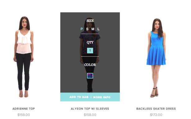
Kun asiakas napsauttaa tällaista painiketta, myymäläsi ei avaa koko tuotesivua. Sen sijaan asiakkaasi näkee ponnahdusikkunan, jossa on tuotevaihtoehtoja:

Jos tuotteessasi ei ole vaihtoehtoja, se menee suoraan ostoskoriin.
Yhteenveto
Tuotteiden asettelun suhteen on parasta pitää kiinni käytännöistä ja seurata sitä, mitä markkinajohtajat jo tekevät. Luetteloi tuotteesi yksityiskohtaisesti, luokittele ne perusteellisesti ja järjestä ne sitten tavalliseen ruudukkoasetteluun.
Yllä jaetut parhaat käytännöt toimivat useimmissa myymälöissä eri aloilla. Kokeile niitä omassa myymälässäsi!
- Kaupan navigoinnin korjaaminen
- Kaikki mitä sinun tulee tietää tuotteiden markkinoinnista
- Verkkokaupankäynti: tuotteiden asettelu verkkokaupassa
- Mitä on muotimarkkinointi ja miksi se on niin tärkeää?
- 10 verkkokauppojen suunnitteluvirhettä
- 15 täydellistä kirjasinparia verkkokauppasivustollesi
- Väriteoria: kaikki mitä sinun tarvitsee tietää väriteemoista
- 7 luovaa ideaa verkkokaupan tuotesivullesi
- Sankarikuvan voima verkkosuunnittelussa
Pakkohankinta Verkkokaupassa noudatettavat UX-periaatteet- Verkkosivuston suunnittelun tarkastus
- Vapauta UX-suunnittelun voima verkkokaupassa
- Mitä eroa käyttöliittymällä ja UX:llä on verkkokaupassa?


