Have you ever wondered why grocery stores place milk at the back of the store and chocolates near the checkout counter?
Yksinkertainen: placing essentials at the back of the store encourages shoppers to walk around and browse other products. Placing small items (like chocolates) near the checkout counter encourages impulse purchases.
This is all a part of the science of store design. The right store layout can boost sales, improve loyalty and help customers find what they want faster.
Your online store isn’t any different. The organization and layout of your products have a big impact on what (and how) customers buy from you.
Tässä artikkelissa, we’ll show you how to layout your products to maximize sales and conversions.
3 Things to Consider When Selecting a Product Layout
Product layout might sound like a straightforward problem when you first approach it. kuitenkin, like most things in e-commerce, the complexities emerge once you dive into the details. There are three things you must consider when you choose a product layout:
1. Choice
Choice is a double-edged sword for e-commerce stores. The lack of choice means you limit opportunities. Too many choices, kuitenkin, and you’ll leave visitors confused.

Effective product layout is essentially a process of balancing this duality. That is: giving the impression of plentiful choice, while still keeping the site easy to use and navigate.
Science says that decision making is mentally taxing. When you confront shoppers with too many choices, they are liable to not make a choice at all.
So how do you overcome this problem in your store layout?
One solution is to use featured images that lead to additional products. Esimerkiksi, notice how Made.com uses separate images for entire product categories (such as “garden furniture”):

Think of this as a teaser to lure in shoppers.
Ihannetapauksessa, you’ll want to keep your best-selling or most-desired products front and center.
Siksi, before you start the layout process, list out the following:
- Your entire product range and their respective categories and subcategories
- Functional categories such as “best selling products”, “featured products”, jne. and the products in them.
The next step is to use this information to construct a well-organized navigational menu. Notice how Amazon organizes products into categories in its menu.

Doing this will help shoppers find what they want without overwhelming them with too many choices.
If your Ecwid store is added to a website, you can add a navigation menu by adding a piece of code:
- for a horizontal layout
- for a vertical layout.


Here are the instructions for Ecwid stores added on WordPress ja Wix verkkosivustoja, liian. On Ecwid Instant Site, the horizontal menu is only available.
2. Product information
Here’s another balancing act you should perform when selecting a store layout: showing product information.
You want to give customers the information they need to click through and make a purchase. Samaan aikaan, you don’t want to overwhelm them with too many details – at least not before they are on the actual product page.
Your mental model in this situation should be to ease decision making and pique customer interest. Kysy itseltäsi: mitä minimum information do my customers need to click through on a product?
You’ll find that this answer varies from store to store and product to product.
Esimerkiksi, notice how Amazon gives you just four information points on the category page: product name, hinta (including discount), rating and Prime availability:

Ecwidissä, you can add similar ratings and reviews with the help of the Stampled.io app.
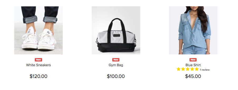
Though this information is necessary for a large retailer like Amazon, for smaller businesses like Sand & Stone Jewelry, ratings aren’t as important. Hence, the category pages only show product name and price.

It’s easy to fall into the trap of giving away too little information in category pages. The best way to avoid this is to interview your customers and ask them what information they use to make purchase decisions.
3. Store design
How you’ve designed your store will have a big impact on your product layout.
An e-commerce store will typically have three key pages:
- Kotisivu
- Category and search pages
- Individual product pages
What products you choose to showcase on each page-type will decide what products your customers end up buying.
Esimerkiksi, note how Amazon promotes its own products on its homepage if you haven’t signed in:

It’s common for stores to promote latest offers on the homepage. Make sure to align these offers with your target audience. BestMadeCo, esimerkiksi, runs a Father’s Day promo keeping in mind its largely male clientele.

Focus on:
- Figuring out what products you want customers to buy (ideally your best selling, and/or highest margin products)
- Maintaining design uniformity across different page-types.
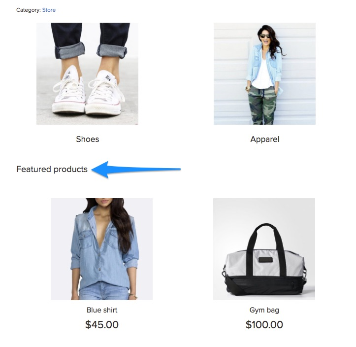
Whether you decide to highlight your best sellers or new arrivals, Ecwid allows you to create a category for featured products on the homepage and name it according to your needs.
6 Best Practices for E-commerce Product Layout
While you can certainly create a unique layout scheme for your e-commerce store, it helps to follow a few best practices.
1. Push top products and offers above the fold
The ‘above the fold’ area is the screen real estate visible when customers first land on your site. Itse asiassa, this area accounts for 80% of all viewer attention on most sites.
Given the kind of attention this space gets, it’s a good idea to place your top products above the fold. This can include:
- Latest offers, sales and discounts
- Best selling product or product categories
- Recently launched products (works best at the start of a shopping season)
Päällä Target.com, esimerkiksi, you’ll see the latest offers at the top of the page:

If you have a lot of offers, consider adding a slider, like this example from Walmart. Also note the promotions running below the navigation menu:

Jotkut muotikauppiaat välttävät tavanomaisia ulkoasuja tuotekuvan edistämiseksi. Päällä ASOS, esimerkiksi, saat tuotekuvan, jossa on vaihtoehto "Osta miehiä" tai "Osta naisia".

Tämä taktiikka toimii, kun yrität edistää brändivisiota lookbookilla. Useimmat jälleenmyyjät, kuitenkin, pärjää paremmin perinteisellä tuotteella - ensin taitoksen yläpuolella.
Noudata samaa ideaa luokkasivuilla: työnnä myydyimmät ja parhaiten arvioidut tuotteesi sivun yläosaan. Esimerkiksi, katso Amazonin luokkasivut:

2. Sekoita vaaka- ja pystyasettelu
On olemassa kaksi tapaa asettaa tuotteet mille tahansa sivulle: vaaka- tai pystysuoraan.
Vaakasuuntainen asettelu pysyy staattisena. Sivun reunassa on painike, jolla voit vierittää tietoja eteenpäin.
Tämä Amazonin esimerkki kuvaa asioita paremmin:

Ecwidissä, äskettäin katsotut tuotteet näytetään myös vaakasuorassa. Voit valita tuotteiden määrän näytettäväksi myymäläsi ylä- tai alaosassa.

Liittyvät tuotteet on toinen vaakasuuntainen osa. Tämän ryhmän tuotteet määritetään yksilöllisesti jokaiselle tuotesivulle, jonka avulla voit kohdistaa asiakkaisiisi erittäin osuvilla lisäyksillä heidän tilauksiinsa. Voit näyttää ne tuotesivuilla ja ostoskorisivulla.

Verrattuna, pystyasettelussa ei ole näitä vierityspainikkeita. Sen sijaan, näet yhä enemmän tuotteita ruudukkomaisessa kohdistuksessa, kun vierität alaspäin. Kuten tämä:

Ihannetapauksessa, sinun tulee käyttää näiden molempien asettelujen yhdistelmää:
- Vaakasuora asettelu, kun haluat näyttää muutamia tuotteita useista luokista, kuten Äskettäin katsotuissa tuotteissa
- Pystyasettelu, kun haluat näyttää paljon saman luokan tuotteita, kuten yksi haku- ja luokkasivu
3. Noudata käytäntöjä ja käyttäjien odotuksia
On tilanteita, joissa haluat olla epätavallinen suunnittelussasi. Tuotteen ulkoasu ei ole yksi niistä.
Tuoteasettelusi on tarkoitettu ohjaamaan käyttäjiä heidän saapuessaan sivustollesi. Perinteinen ulkoasu varmistaa, että he löytävät haluamansa eivätkä joudu sekaan.
yleissopimukset, tietysti, vaihtelevat sektoreittain. kuitenkin, sinun tulee harkita muutamia asioita:
Käytä ruudukkoasettelua
Ruudukkoasettelussa, tuotteet on järjestetty samankokoisiin suorakaiteen muotoisiin laatikoihin, kuten tämä:

Tämä asettelu on pitkään ollut verkkokauppasivustojen yleissopimus. Asiakkaasi eivät vain tuntisi sitä, se sopii myös tuotteiden esillepanoon. Edelleen, it scales well – you can display just one box on small screens, tai laajenna useisiin laatikoihin suuremmissa.
Kun käytät tätä asettelua, varmista, että laatikot ovat samankokoisia. Kuten tämä tapaustutkimus osoittaa, samankokoisten laatikoiden käyttö voi kasvattaa tuloja vierailijaa kohden jopa 17%.

Jos myyt Ecwidin kanssa, se ei ole sinulle ongelma – Ecwidissä on samankokoinen ruudukko, joka mukautuu automaattisesti eri näyttöihin.
Näytä navigointi tuotetietojen yläosassa
Toinen käytäntö, jota sinun tulee noudattaa, on sijoittaa lajitteluvaihtoehdot sivun yläosaan.

Asiakkaat ovat tottuneet odottamaan tätä sijoittelua ja katsovat luonnollisesti tänne, kun he päätyvät luokkasivulle.
Suuntaa asiakkaat korppujauhoilla
Tarrapolut ovat navigointielementtejä, jotka näyttävät käyttäjille heidän polkunsa etusivulta, kuten tämä:
Niiden lisääminen sivun alkuun auttaa vierailijoita orientoitumaan. Se kertoo heille, mihin sivuun tai kategoriaan he kuuluvat ja kuinka he voivat palata etusivulle.
4. Keskity visuaalisuuteen, mutta älä unohda tekstiä tuotesivuilla
verkossa, Ainoa tapa esitellä tuotteitasi on visuaalien avulla. Tästä syystä suurten tuotekuvien tiedetään lisäävän verkkokaupan tuloksia.
kuitenkin, kun taas visuaalisuus on tärkeää, ulkoasussasi tulee myös olla tilaa kuvailevalle tekstille. Hyvä kopio ei vain kuvaa tuotetta, mutta myös auttaa myymään sitä ja brändiäsi.
Esimerkiksi, mieti, kuinka BestMadeCo käyttää kotisivullaan vahvaa kopiota äskettäin lanseeratun tuotteen myymiseen. Asettelu auttaa tekstiä toistamaan täydellisesti kuvaa vasten.

Tuotteen kopio on erityisen tärkeä tuotesivuilla. Your layout should give customers all the key information they need to make a decision right above the fold. This should include:
- Hinta (including discount, represented visually)
- Product rating and number of reviews
- Product and brand names
- Whether the product is in stock (and whether stock is running low)
- Shipping details
- 2-3 key product details
This is an example of how not to layout products. The product page has no copy at all – it’s difficult to make a decision.

As with most things, Amazon’s layout is perfect here, antaa asiakkaille kaiken, mitä he tarvitsevat päätöksentekoon.

5. Lisää tuotesuosituksia ja niihin liittyviä tuotteita
Tuotesivuilla, sinulla on kaksi tavoitetta:
- Vie asiakas kassasivulle, tai
- Pyydä asiakas katsomaan toista tuotetta
Jälkimmäiselle, sinulla pitäisi olla suositeltujen tai vastaavien tuotteiden osio. Voit sijoittaa tämän joko tuotetietojen jälkeen tai ennen sitä.
Amazon tekee tämän erityisen hyvin. Huomaa aiheeseen liittyvät tuotteet ja "myös katsotut" luettelot sivun alaosasta:

Jos sinulla on useita tuotteita samassa kokoelmassa, muista myös näyttää ne. Tässä on hyvä esimerkki WorldMarketista:

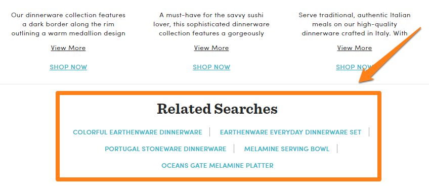
Aiheeseen liittyvien tuoteluetteloiden ei aina tarvitse olla visuaalisia. Voit myös näyttää aiheeseen liittyviä hakuja ohjataksesi asiakkaat kohteille, joista he saattavat olla kiinnostuneita.
Kokeile vastaavien/suositeltujen tuotteiden erilaisia asetteluja. Yritä sijoittaa ne alatunnisteen yläpuolelle, alla tuotekuvaus, jne.
6. Kokeile hiiren osoitinta luokkasivuilla
Yksi tapa parantaa napsautussuhteita on tarjota lisätietoja, kun asiakas siirtää hiiren osoitinta tuotekuvan päälle luokkasivuilla..
Esimerkiksi, tämä sivusto näyttää tuotetiedot ja Lisää ostoskoriin -painikkeen hiiren osoitin:
Tämän taktiikan tarkoituksena on antaa käyttäjille tärkeimmät tiedot yhdellä silmäyksellä. Se toimii parhaiten, kun odotat käyttäjien selaavan useita tuotteita nopeasti, kuten vaatekaupoissa. Se ei välttämättä toimi muissa luokissa, mutta voit silti suorittaa muutaman jaetun testin ja nähdä tulokset.
Ecwidissä, Voit ottaa "Osta nyt" -painikkeet käyttöön tuoteluetteloissa, jotta asiakkaat voivat selata nopeasti (ja ostaa) tuotteesi.

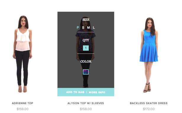
Kun asiakas napsauttaa tällaista painiketta, kauppasi ei avaa koko tuotesivua. Sen sijaan, asiakkaasi näkee ponnahdusikkunan, jossa on tuotevaihtoehtoja:

Jos tuotteessasi ei ole vaihtoehtoja, se menee suoraan kärryyn.
Johtopäätös
Mitä tulee tuotteen ulkoasuun, on parasta pitää kiinni käytännöistä ja seurata sitä, mitä markkinajohtajat jo tekevät. Luetteloi tuotteesi yksityiskohtaisesti, luokitella ne perusteellisesti, then organize them out in a standard grid layout.
The best practices shared above will work for most stores across sectors. Try them at your own store!
- How to Fix Your Store’s Navigation
- Kaikki mitä sinun tulee tietää tuotteiden markkinoinnista
- Online Merchandising: How to Layout Products in Online Store
- What is Fashion Merchandising, and Why Is It So Important?
- 10 Verkkokauppojen suunnitteluvirheet
- 15 Täydelliset kirjasinparit verkkokauppasivustollesi
- Väriteoria: Kaikki mitä sinun tulee tietää väriteemoista
- 7 Luovia ideoita verkkokaupan tuotesivullesi
- Sankarikuvan voima verkkosuunnittelussa
- UX-periaatteet, joita on noudatettava verkkokaupassa
- Verkkosivuston suunnittelun tarkastus
- Vapauta UX-suunnittelun voima verkkokaupassa
- Mitä eroa on käyttöliittymän ja UX:n välillä verkkokaupassa??