Have you ever wondered why grocery stores place milk at the back of the store and chocolates near the checkout counter?
Simple: placing essentials at the back of the store encourages shoppers to walk around and browse other products. Placing small items (like chocolates) near the checkout counter encourages impulse purchases.
This is all a part of the science of store design. The right store layout can boost sales, improve loyalty and help customers find what they want faster.
Your online store isn’t any different. The organization and layout of your products have a big impact on what (and how) customers buy from you.
In this article, we’ll show you how to layout your products to maximize sales and conversions.
3 Things to Consider When Selecting a Product Layout
Product layout might sound like a straightforward problem when you first approach it. However, like most things in
1. Choice
Choice is a

Effective product layout is essentially a process of balancing this duality. That is: giving the impression of plentiful choice, while still keeping the site easy to use and navigate.
Science says that decision making is mentally taxing. When you confront shoppers with too many choices, they are liable to not make a choice at all.
So how do you overcome this problem in your store layout?
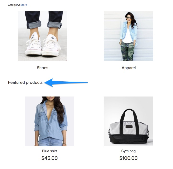
One solution is to use featured images that lead to additional products. For example, notice how Made.com uses separate images for entire product categories (such as garden furniture):

Think of this as a teaser to lure in shoppers.
Ideally, you’ll want to keep your
Therefore, before you start the layout process, list out the following:
- Your entire product range and their respective categories and subcategories
- Functional categories such as best selling products, featured products, etc. and the products in them.
The next step is to use this information to construct a

Doing this will help shoppers find what they want without overwhelming them with too many choices.
If your Ecwid store is added to a website, you can add a navigation menu by adding a piece of code:
- for a horizontal layout
- for a vertical layout.


Here are the instructions for Ecwid stores added on WordPress and Wix websites, too. On Ecwid Instant Site, the horizontal menu is only available.
2. Product information
Here’s another balancing act you should perform when selecting a store layout: showing product information.
You want to give customers the information they need to click through and make a purchase. At the same time, you don’t want to overwhelm them with too many details — at least not before they are on the actual product page.
Your mental model in this situation should be to ease decision making and pique customer interest. Ask yourself: what minimum information do my customers need to click through on a product?
You’ll find that this answer varies from store to store and product to product.
For example, notice how Amazon gives you just four information points on the category page: product name, price (including discount), rating and Prime availability:

In Ecwid, you can add similar ratings and reviews with the help of the Stampled.io app.
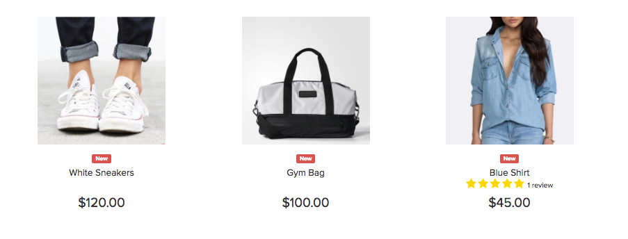
Though this information is necessary for a large retailer like Amazon, for smaller businesses like Sand & Stone Jewelry, ratings aren’t as important. Hence, the category pages only show product name and price.

It’s easy to fall into the trap of giving away too little information in category pages. The best way to avoid this is to interview your customers and ask them what information they use to make purchase decisions.
3. Store design
How you’ve designed your store will have a big impact on your product layout.
An
- Homepage
- Category and search pages
- Individual product pages
What products you choose to showcase on each
For instance, note how Amazon promotes its own products on its homepage if you haven’t signed in:

It’s common for stores to promote latest offers on the homepage. Make sure to align these offers with your target audience. BestMadeCo, for instance, runs a Father’s Day promo keeping in mind its largely male clientele.

Focus on:
- Figuring out what products you want customers to buy (ideally your best selling, and/or highest margin products)
- Maintaining design uniformity across different
page-types.
Whether you decide to highlight your best sellers or new arrivals, Ecwid allows you to create a category for featured products on the homepage and name it according to your needs.
6 Best Practices for E-commerce Product Layout
While you can certainly create a unique layout scheme for your
1. Push top products and offers above the fold
The above the fold area is the screen real estate visible when customers first land on your site. In fact, this area accounts for 80% of all viewer attention on most sites.
Given the kind of attention this space gets, it’s a good idea to place your top products above the fold. This can include:
- Latest offers, sales and discounts
- Best selling product or product categories
- Recently launched products (works best at the start of a shopping season)
On Target.com, for instance, you’ll see the latest offers at the top of the page:

If you have a lot of offers, consider adding a slider, like this example from Walmart. Also note the promotions running below the navigation menu:

Some fashion retailers eschew conventional layouts in favor of promoting a brand image. On ASOS, for instance, you get a brand image with an option to Shop Men or Shop Women.

This tactic works when you’re trying to promote a brand vision with a lookbook. Most retailers, however, will do better with a conventional
Follow the same idea on category pages: push your

2. Mix horizontal and vertical layouts
There are essentially two ways you can layout your products on any page: horizontally or vertically.
A horizontal layout remains static. There’s a button at the edge of the page to scroll the listings further.
This example from Amazon illustrates things better:

In Ecwid, recently viewed products are also shown horizontally. You can choose the number of items to display them on top or at the bottom of your storefront.

Related products is another

In contrast, a vertical layout doesn’t have these scroll buttons. Instead, you see more and more products in a

Ideally, you should use a mix of both these layouts:
- Horizontal layout when you want to show a few products from lots of categories, such as in Recently Viewed Products
- Vertical layout when you want to show lots of products from the same category, such as one search and category pages
3. Follow convention and user expectations
There are situations when you’ll want to be unconventional with your design. The product layout isn’t one of them.
Your product layout is meant to orient users when they land on your site. A conventional layout ensures that they find what they want and don’t get disoriented.
Conventions, of course, vary from sector to sector. However, there are a few things you must consider:
Use a grid layout
In a grid layout, products are arranged in

This layout has long been the convention for
When using this layout, make sure to keep the boxes equally sized. As this case study shows, using equally sized boxes can increase revenue per visitor by as much as 17%.

If you sell with Ecwid, that is not a problem for you — Ecwid has an equally sized grid that automatically adapts to different screens.
Show navigation at the top of product listings
Another convention you should follow is to place your sorting options at the top of the page.

Customers have come to expect this placement and will naturally look here when they land on a category page.
Orient customers with breadcrumbs
Breadcrumbs are navigational elements that show users their path from the homepage, like this:
Adding them to the to top of the page helps orient visitors. It tells them what page or category they’re in and how they can go back to the homepage.
4. Focus on visuals, but don’t forget the text on product pages
Online, the only way to show your products is through visuals. This is why large product images are known to boost
However, while visuals are important, your layout should also have room for descriptive text. Good copy not only describes the product, but also helps sell it and your brand.
For example, consider how BestMadeCo uses strong copy on its homepage to sell a recently launched product. The layout helps the text play off against the image perfectly.

Product copy is particularly important on product pages. Your layout should give customers all the key information they need to make a decision right above the fold. This should include:
- Price (including discount, represented visually)
- Product rating and number of reviews
- Product and brand names
- Whether the product is in stock (and whether stock is running low)
- Shipping details
2-3 key product details
This is an example of how not to layout products. The product page has no copy at all — it’s difficult to make a decision.

As with most things, Amazon’s layout is perfect here, giving customers everything they need to make a decision.

5. Add product recommendations and related products
On product pages, you have two goals:
- Get the customer to the checkout page, or
- Get the customer to view another product
For the latter, you should have a recommended or related products section. You can place this either after the product information or before it.
Amazon does this particularly well. Notice the related products and also viewed listings below the fold:

If you have multiple products in the same collection, make sure to display them as well. Here’s a good example from WorldMarket:

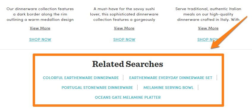
Related product listings don’t always have to be visual. You can also show related searches to direct customers to items they might be interested in.
Experiment with different layouts for related/recommended products. Try placing them above the footer, below product description, etc.
6. Experiment with mouseover details on category pages
One way to improve
For example, this site shows product details and an add to cart button on mouse hover:
The purpose of this tactic is to give users key information at a glance. It works best when you expect users to browse through a large number of products quickly, such as in clothing stores. It might not work for other categories, but you can still run a few split tests and see the results.
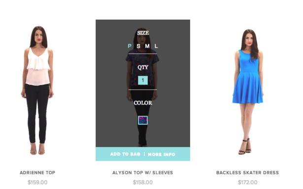
In Ecwid, you can enable Buy Now buttons on product lists to help your customers quickly browse (and buy) your products.

When a customer clicks such a button, your store won’t open the whole product page. Instead, your customer will see a popup with product options:

If your product doesn’t have options, it’ll go straight to the cart.
Conclusion
When it comes to product layout, it’s best to stick to convention and follow what market leaders are already doing. Catalog your products in detail, categorize them thoroughly, then organize them out in a standard grid layout.
The best practices shared above will work for most stores across sectors. Try them at your own store!
- How to Fix Your Store’s Navigation
- Everything You Need to Know About Product Merchandising
- Online Merchandising: How to Layout Products in Online Store
- What is Fashion Merchandising, and Why Is It So Important?
- 10 Design Mistakes of Online Stores
- 15 Perfect Font Pairings for Your Ecommerce Website
- Color Theory: Everything You Need to Know about Color Themes
- 7 Creative Ideas for Your Ecommerce Product Page
- The Power of a Hero Image in Web Design
Must-Have UX Principles to Follow in an Online Store- Website Design Audit
- Unlocking the Power of UX Design for Ecommerce
- What’s the Difference Between UI and UX in Ecommerce?