Your store is set up and you’ve got products in it, and you’re finally ready to start sending some traffic to it and raking in that cash. The problem: if your store is hard to navigate, you’re sending traffic into a sieve — people will go in one end and out the other, without buying anything (and wasting your effort or ad spend in the process!).
Obviously, that’s no good. Here’s what you can do to prevent that scenario.
Don’t Overwhelm Your Visitor
Overwhelmed people don’t buy. You’re probably familiar with the jam study
Other studies done since then have backed this up; if you present customers with too many options, they’ll try to weigh the pros and cons of all of them, get tired of going over all the details and wind up not making a choice (i.e., buying) at all.
On the flip side, you don’t want your store to look empty and make customers think that your store is under construction or isn’t a professional endeavor.
If you have one flagship product while you’re expanding your store, you should choose a theme and design that brings your one product front and center, instead of making it look like it’s sitting in an empty storefront.
If you only have two or three products, you’ll also want to change your design accordingly or show different color variations as their own products to keep your store from looking too empty.
Similarly, when it comes to categories, you want to choose as few categories as possible (so as not to overwhelm the shopper), but create enough categories that each category is useful. If you only have two categories, but each category has 50 items in it, you might be better off creating
Ecwid user Shea Kardel is a good example of this, with their women’s clothing category, broke down into six subcategories:
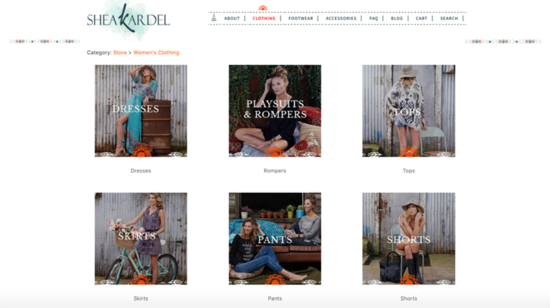
Shea Kardel
Having to choose between six categories is much easier than choosing from 12 or 20, and then when the visitors clicks a category, they’re taken to a page with no more than nine products. It’s virtually impossible to get overwhelmed while browsing this shop.
Make it Easy for Customers to Search
Your shopper might not want to browse — they might be looking for one specific thing. If that’s the case, the first thing they’re going to look for is the search bar. It should be easy to find, like on Old Sole Boot Company’s site:
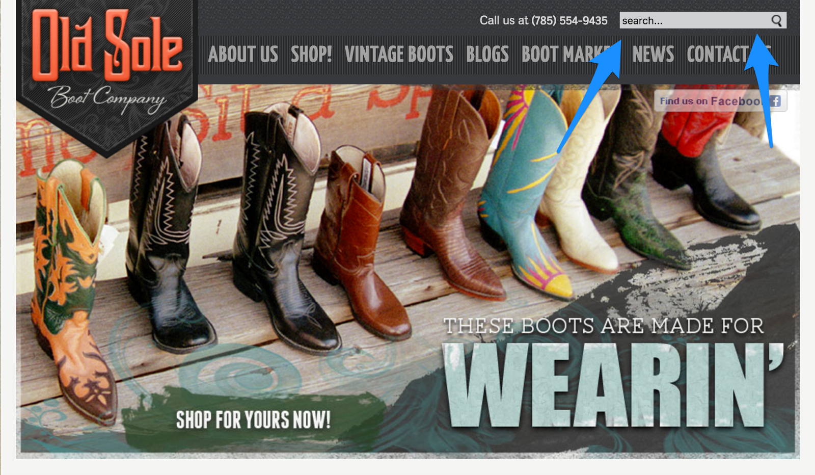
Old Sole Boot Company
Shoppers will typically look for the search bar (or a magnifying glass icon) along the top menu or in a sidebar, so that’s where your’s should be. If you want to make it extra visible, you can make the search button or bar a different color than the rest of your text. You can also use the Product Search Enhancer app to
Make it Easy to Sort
When someone heads to a category or the search results page on your site, the results aren’t typically randomly ordered — they’re sorted in some way. How you sort your products by default depends on what you want to do:
- To entice visitors and capture their attention, you can sort starting with the lowest prices.
- To “price anchor,” you can do the opposite and start with the higher prices. The thinking behind this is that the first price a customer sees sets the “default,” so prices lower than that seem like a better deal than they would have otherwise. For example, if you’re shopping for shirts and you’ve been browsing
$40-60 shirts, a $25 shirt seems like an incredible deal. - If you show reviews on your category/product listing pages, you can sort it, so that highly reviewed items show up first by default to impress customers.
Customers should be able to easily see the sorting options and be able to resort the products on their own if they want. Standard options are date added, ascending and descending price, and alphabetically or reverse alphabetical order.
If you have enough products, you might want to offer filtering options on category pages and in search results. Again, you don’t want to overwhelm people, so if you do offer a filter, set it as a
This way, the filters are hidden until the person clicks “Filter” and then is presented with options. Depending on what you’re selling, you can let people sort by color, size, functionality, or other attributes that make sense. To do this using Ecwid, you can use the product filters API combined with Javascript to create a filter widget in your sidebar.
Just remember that your filters shouldn’t take the place of categories — rather than having people filter by type of apparel, for example, you should have the types of apparel as categories.
Then, once they head to the right category, letting them filter by option (short sleeve or long sleeve), size, color, etc. makes sense and is less likely to overwhelm them. And remember, filters might not even be necessary depending on how many items you have — you might just need enhanced searching features.
The Do’s and Don’t’s of Menus
The menu across the top of your site can do a lot to help or hurt your customers. Here’s a checklist of things to consider about your menu:
Before we move on to anything else, let’s cover some questions you should ask yourself:
- Visibility: If your menu is hard to spot, you need to make it bigger. It needs to be easy to see and easy to click or tap (on a phone). Also, people look at the top of sites and on sidebars for navigation — having your menu anywhere else will be confusing, no matter how cool it looks.
- Clarity: It’s tempting to come up with “cool” or funny names for pages that showcase your personality, but for someone new to your site, clarity comes first. If you must have clever (but not easy to understand) page names, include the more common name after it in parentheses — for example, “Origin Story (About)”.
- Highlighting: If there’s a specific option that you want people to click — one area of your shop that tends to be more profitable or is a best seller — you can make sure people notice it by making the link a different color than the rest of them. While you’re at it, make sure that your menu links actually look like links — they should be underlined, a different color when highlighted, or otherwise look different than
non-clickable text. - Simplicity: Try to keep your menu at six items or less to make it look clean and
non-cluttered (and keep visitors from getting overwhelmed). Also, look for unnecessary words that you can cut out — “products” instead of “our products,” for example.
Make Sure Mobile Visitors Can Easily Browse
With mobile commerce being 30% of all
- Search bar/icon: Is it easily visible? Does it expand with one tap?
- Menu: Is it easy to find? Do they have to scroll incessantly to find a category?
- Products: Do the default product images show up really large on a mobile screen? Is the title of the product, and the product information, easily readable?
- General readability: Is the text big enough to read? Are there any instances of text overlapping badly with images?
If you can, give your shop address to a few acquaintances who haven’t browsed there much, and watch them navigate it on their phone. The places they get confused will give you valuable information about design changes you should make.
Your Next Steps
Here’s what you can do today to make your store easier to navigate and stop losing customers:
- Try to keep your categories and menu options (and your options in general, but especially the
top-level options that are the first things a new visitor will encounter) to six or less options - Make it easy for people to sort and search for products by making those options visible (by making them a different color, big enough to easily see, or visually highlighting them in another way)
- Strategically choose what the default sorting method is for your products and test different ones to see what gets results
Good luck! And don’t forget to subscribe to the blog if you want to get more updates with helpful tips like this in the future.
- How to Fix Your Store’s Navigation
- Everything You Need to Know About Product Merchandising
- Online Merchandising: How to Layout Products in Online Store
- What is Fashion Merchandising, and Why Is It So Important?
- 10 Design Mistakes of Online Stores
- 15 Perfect Font Pairings for Your Ecommerce Website
- Color Theory: Everything You Need to Know about Color Themes
- 7 Creative Ideas for Your Ecommerce Product Page
- The Power of a Hero Image in Web Design
Must-Have UX Principles to Follow in an Online Store- Website Design Audit
- Unlocking the Power of UX Design for Ecommerce
- What’s the Difference Between UI and UX in Ecommerce?